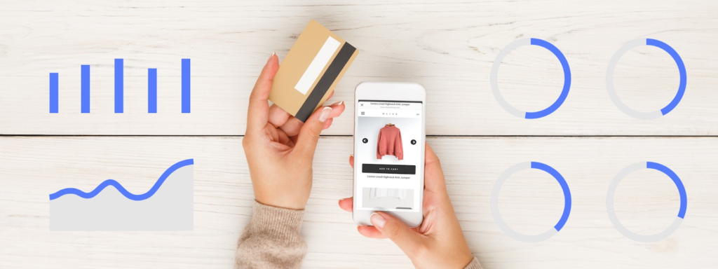
Your eCommerce business is into the market, and you are just happy with it, but won’t you like to see your business grow leaps and bounds, revenues manifolding, and you take a deep sleep? All this can take place only when you can see the conversion rate at surge.
So, What is the conversion rate for e-commerce worldwide?
The average eCommerce conversion rate usually falls between 1 to 4 per cent across the globe while there is a substantial disparity between countries.
For converting the traffic into sales, you can not overlook the user journey from landing on to the site until leaving the checkout page with some purchase. This is the only time where you can convert the website traffic into a potential buyer.
Your website should be appropriately optimised and aligned to the business goals as the customers want their desired things soon as they land on to the page.
So what needs to be fixed?
Design of your eStore! It is the most common aspect of CRO (Conversion Rate Optimisation) that is the process of optimising the web store for conversions.
To help you design a more delightful and intentional conversion path on your e-commerce website, we’ve put together a list of some best practices to follow.
These ten design tips will help you make a few tweaks or encourage you to rethink your website to improve your conversion rate ultimately.
- Use a consistent, enticing and complementary colour scheme
Compel your visitors to click on the checkout button by providing them with a right eye for colour. A wise choice of colour combination will entice the customer’s attention and provoke them for CTA.
You can use color.adobe.com for getting an idea of complementary colours in case you are designing your website. They create a colour wheel for you where you can mix and match different colours.
Use your brain and make sure to add a mix of warm and bright colours such as blue, teal, hot pink etc. Always try to use bright colours for the CTA buttons as it will increase the chance of a conversion.
- Add Clear CTAs
The CTA must be short, sweet and appropriate as it is essential to convert website traffic into sales.
Use contrasting colours and unique design elements to enhance the user experience. Also, always keep in mind that the CTA is aligned to the intent of the webpage.
Remember webpage and not a website
The CTA for a content page can be “Read More” while the CTA of any product page would be “BUY NOW” or “ADD TO CART”.
- Evoke a Sense of Urgency
Creating a sense of urgency in the eCommerce site increases the conversation rate by 332%. Let’s see how you can achieve this!
Give a twist and change your wordings from Shop Here” to “Shop Now”. Or in case, if you are running a sale, then you can display a countdown button at the top of the page which will create a state of urgency in their mind.
Additionally, you can also display a countdown timer at the time of checkout so that the buyer tends to speed up the payment processing. For example “your order is reserved for 12:24:35 minutes”.
- Offer simple, easy and one-click checkout
Shorten the checkout process by offering one-click checkout and streamlined approach to your customers. Removing extra steps will decrease the rate of cart abandonment and boost conversions.
Design your UI and UX in such a way that will let your buyer fill in very minimum data input as it is way tiring for everybody. However, you can use these optimisation principles in mind while designing the checkout page:
Try to eliminate all the unnecessary elements from the page that are not frequently in use.
Display trust logos so that the customers feel that their money and personal information is secure.
- Add Green Bar – SSL
Displaying green bar SSL in the website URL builds trust among the buyers and insists them to purchase. However, every browser shows the SSL differently; the goal behind displaying it is still the same.
A green bar SSL encrypts the buyer’s payment information, and so the hackers and scam artists find it harder to steal their data. In short, visitors tend to leave the site if they find it unsecure.
- Add well-selected imagery
Survey says that very few site visitors read the content line by line on the website. Only sixteen per cent of the site visitors go through the entire content.
So, it speaks that you should include high-quality photos of the products from different angles and complete information. In short, we can say that images make a massive impact on the customer’s understanding of the brand and the product.
- Make your site mobile optimized
Optimise your site for mobile as mobile accounts to about half of the web traffic globally. We all know that the phone signal increases and drops every single second thus reducing the load time. So, it’s quite essential to optimise your site as these simple steps can convert the visitors into buyers.
According to the mobile app stats, approx 59% of the smartphone users prefer to use eCommerce applications that allow them to make a quick purchase.
Just building an app is not enough; users will never prefer a shopping app that is slow and time-killing.
This is obvious that you will not like the shopping app, which is slow in the process. Just to enter in that app is not ok. Building user loyalty is the sign of a massive work of success, so don’t give them a reason to disengage. Try to inculcate a progress bar if the checkout requires several steps.
- Study consumer reviews
Study reveals that 88 per cent of consumers have a trust factor in online reviews rather than personal recommendations.
Break down the ratings into different aspects of the products such as design, quality, comfort in case it is for any clothing brand. These reviews will help you with recommendations and comparing the products to compete with other brands.
- Make the ideas more transparent, especially in product pages
Every page on your site should have a single objective. And for your product pages, your goal is to get a customer to add to cart.
When designing a product page, you must apply a logical visual hierarchy to your design. A visual scale is an order in which a user processes information on a page and in the case of a product page, there must be a clear path to your add to cart button with as few distractions as possible.
Take Away
At first, try to figure out the conversion rate and then try to follow the tips and strategies mentioned above.
It’s not that you need to implement all these designing tips for your eStore, it’s you who will decide the best of the methods to increase the conversion rate.
Remember that it is your website design that reflects your brand image and put your products in the best light possible. Make your customers feel like a king as they are the only one who pumps money into your account.
If you also own an eStore and are worried about the conversion rate, contact a good eCommerce website designing company in India who will guide you through the best web designing tips that will increase your conversions in no time.
ThemeKraft offers the opportunity to create content for us. Guest Post
I’m Varun Bhagat, a technical consultant & blogger working for PixelCrayons
which is a leading app & web development company in India www.pixelcrayons.com.
I love to share my tech knowledge gained over a period of 10+ years with
like-minded people.


0 Comments